Swiss design director based in New York City. Director of Design at GrandArmy
8 years of experience in the branding industry for brands like Coca-Cola, IKEA, Hilton and Switzerland.
Featured on It's Nice That, The Brand Identity, Brand New and Fonts In Use
Let’s talk about future opportunities.
Scroll down for projects.
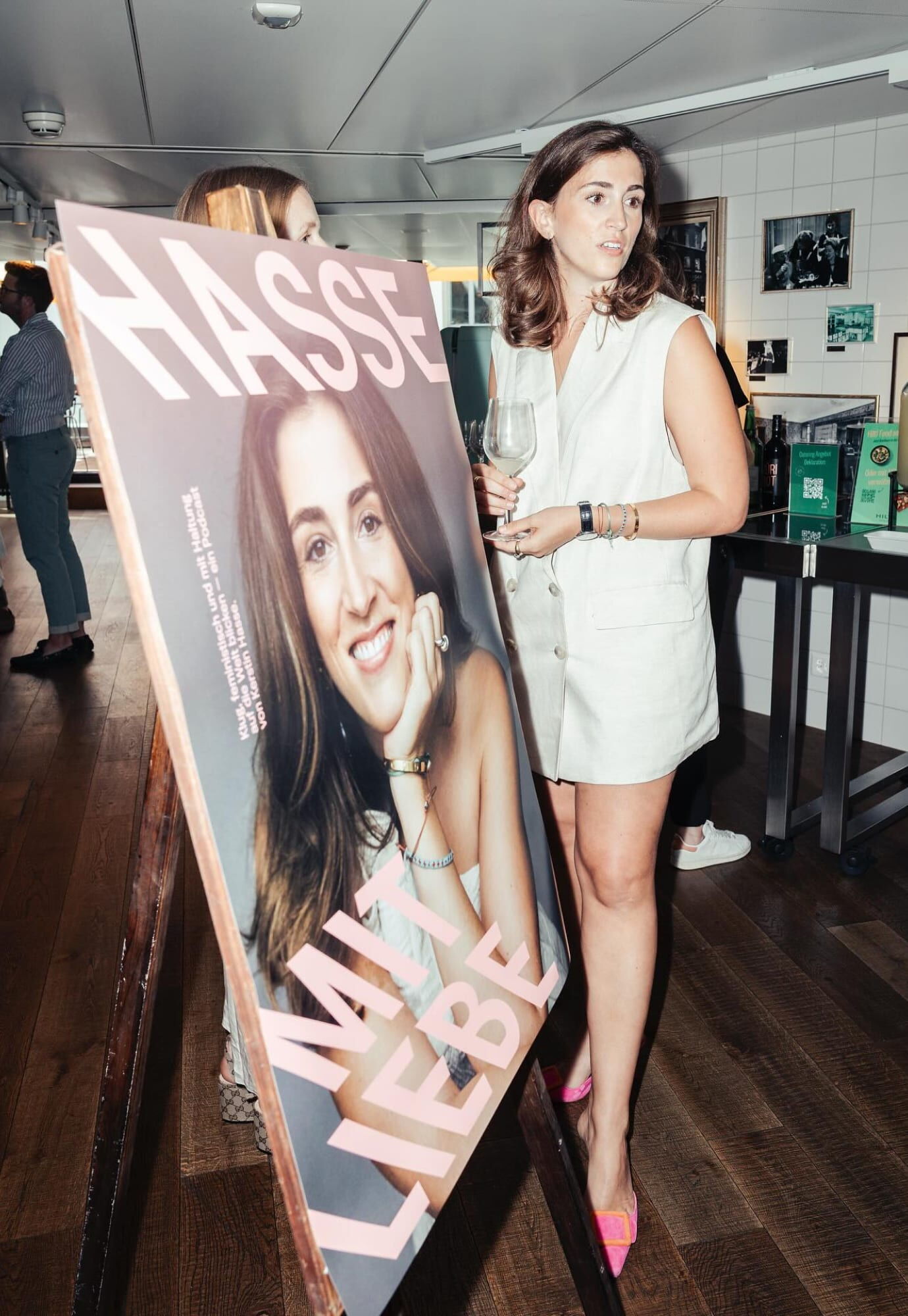
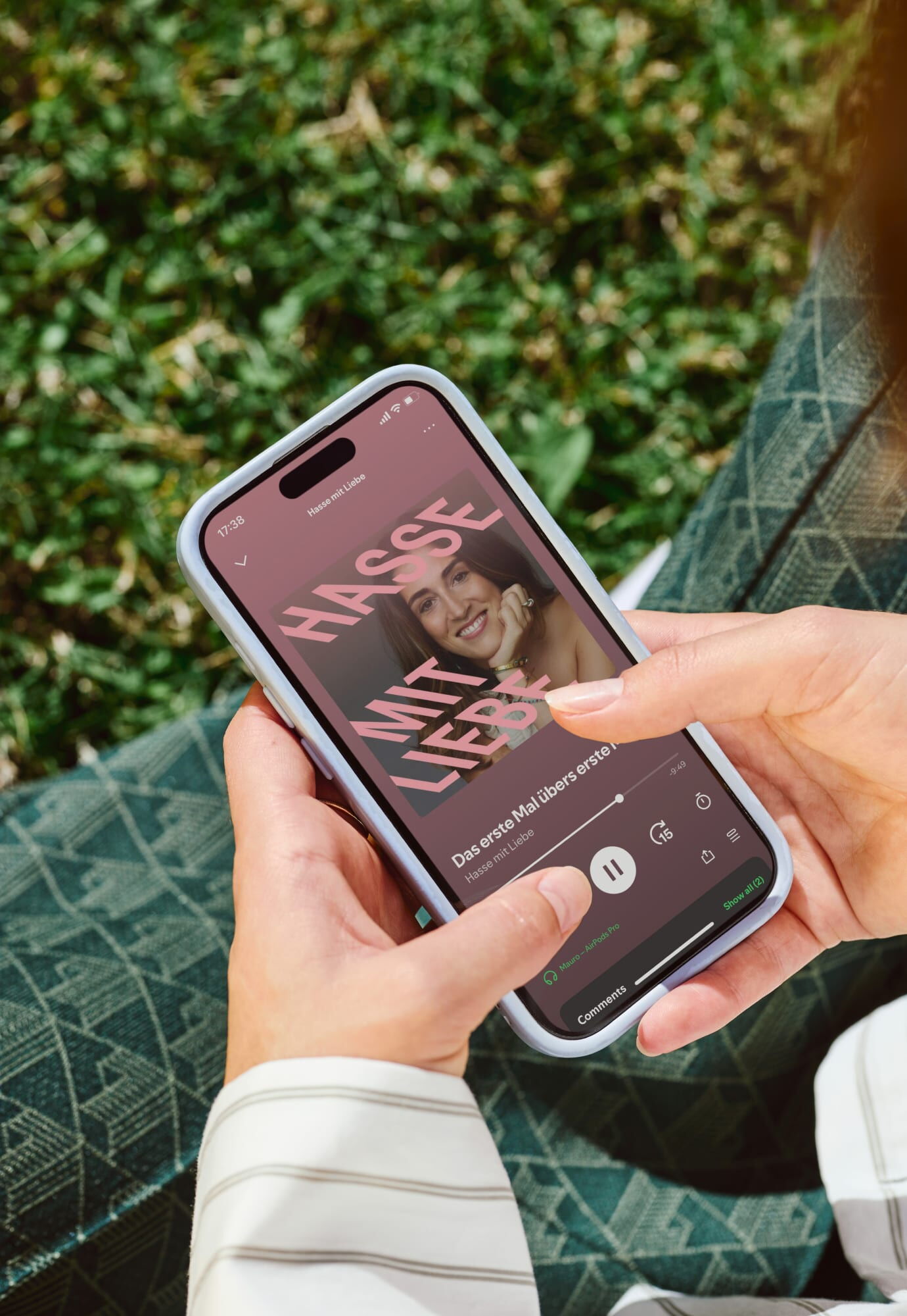
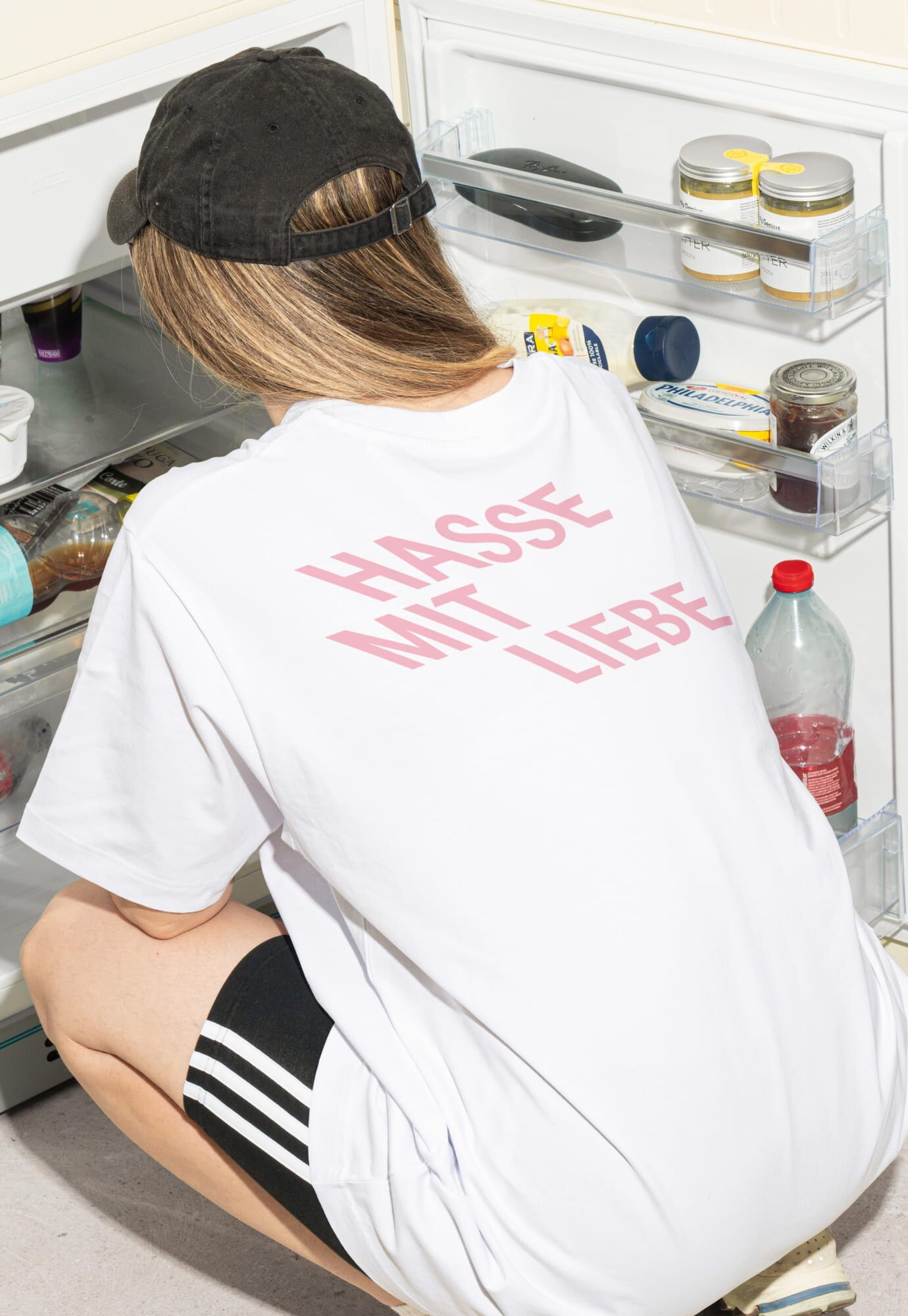
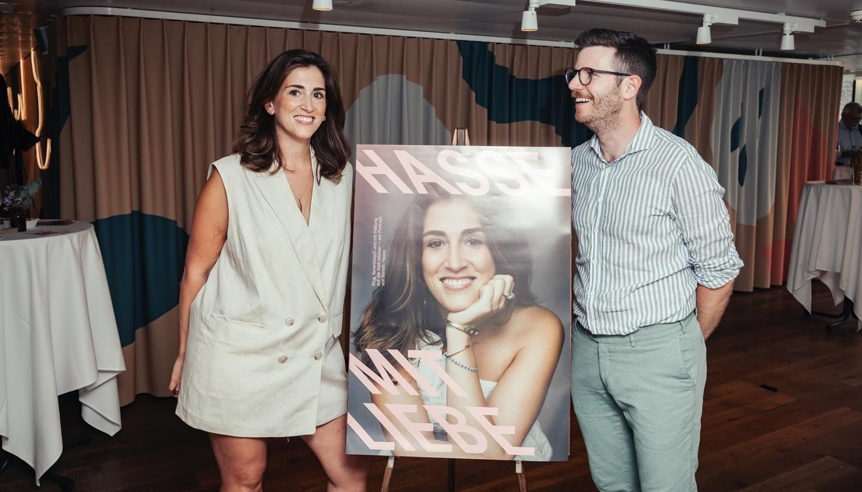
 From Magazine to Podcast — Hasse mit Liebe
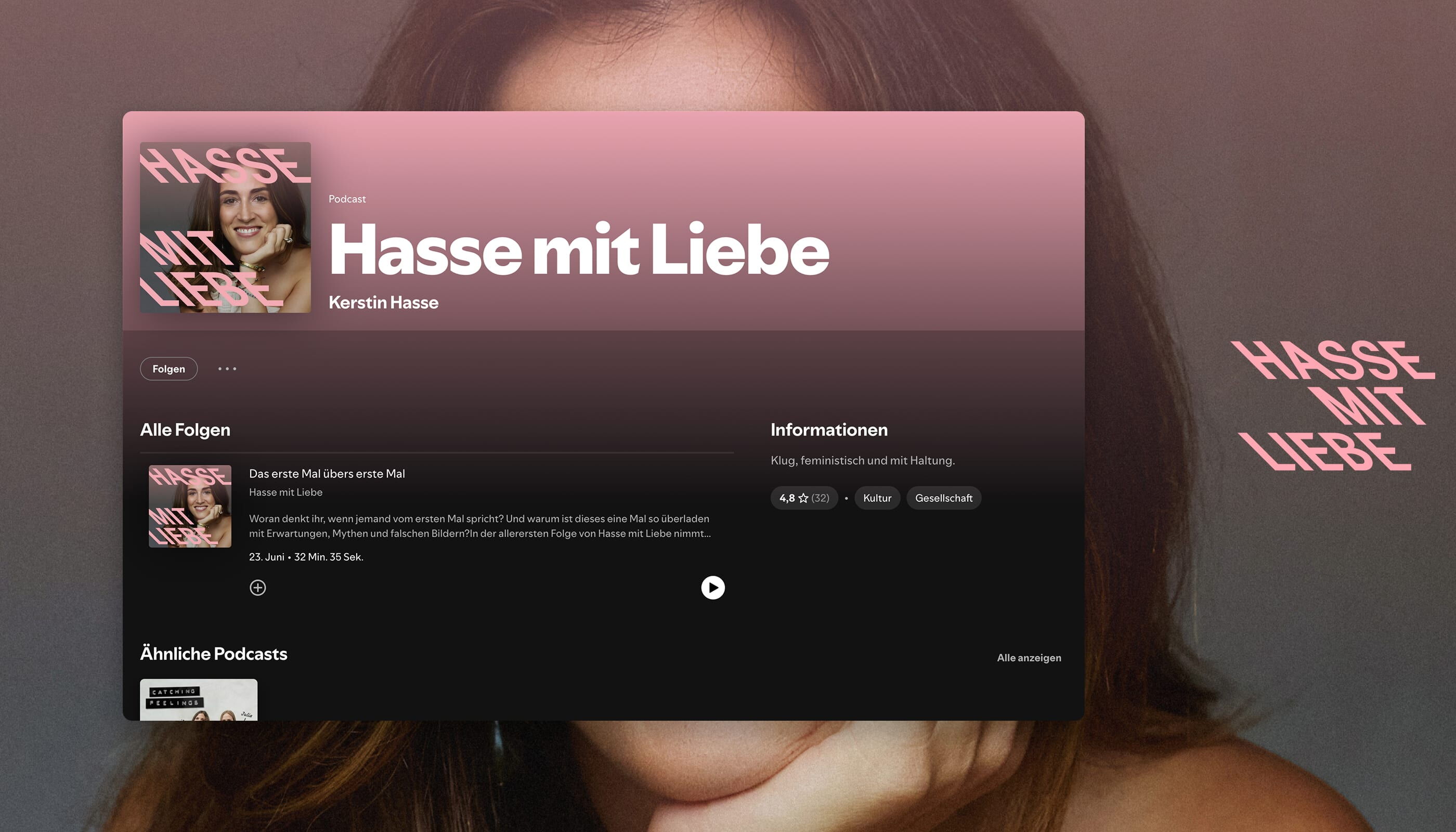
This is a visual identity project for Hasse mit Liebe, a podcast by Zurich-based journalist Kerstin Hasse, addressing feminism, politics, and pop culture with clarity, confidence, and personal voice.
At the core of the process was a deliberate tension. We openly questioned whether using pink for a feminist podcast would feel too literal or risk slipping into visual cliché. Rather than avoiding the color, the strategy was to confront it—by pairing it with a typographic counterweight that resists softness and familiarity.
The solution lies in contrast. Pink is used unapologetically, but is visually broken by a hard, rational type choice: GT Planar Ritalic. The typeface brings sharpness, structure, and ideological alignment—its left-leaning italic echoing both Kerstin’s political stance and the podcast’s point of view.
The resulting identity balances warmth and rigor. It allows the brand to be clearly feminist without becoming generic, and expressive without losing intellectual precision—mirroring the tone of the podcast itself: personal, pointed, and grounded in attitude.
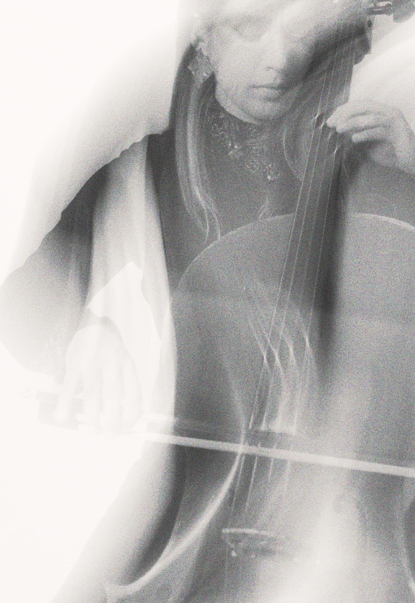
Cover Photography
Raphaela Pichler
Event Photography
Jonathan Labusch
Typeface
GT Planar (Grilli Type)
(Branding)
(Applications)
(Motion Design)
Stil vor Talent (Berlin)

This project was developed in Berlin in close collaboration with the people behind Oliver Koletzkis legendary techno label Stil vor Talent. The goal was to evolve the label from a logo-driven identity into a dynamic brand system—one that reflects the energy, culture, and physicality of techno.
The concept originated from the angled typography of the original logo. This formal detail became the basis for a rotating logo, reimagined as the center label of a vinyl record. The logo is always positioned at the center of the layout, turning every application into a record—whether it’s a sleeve, a t-shirt, packaging, or the website itself.
Movement defines the system. When motion is possible, the logo physically spins. When motion is not possible, the logo appears at varying angles, capturing a moment within the rotation. This approach allows the identity to remain in constant motion—static or animated—while preserving a strong visual core.
Supporting elements amplify the system’s attitude: high-contrast, electric color combinations, a raw techno-inspired icon set, a variety of quirky and fun illustrations, and bold, highly characteristic typography. Together, they create a brand language that is unapologetically club-driven—precise, loud, and built around rhythm, repetition, and movement.


Illustrations
@11v151131_M06
Photography/Video
Amy Reiter, Berlin
Typefaces
Bossa (Family Type, Sydney)
KH Teka (Kurppa Hosk Type, Stockholm)
Much Love to
Stil vor Talent, Berlin

(Brand Strategy)
(Brand Design)
(Web Design)
(Applications)
(Brand Guidelines)
(Motion Design)
(Merch)
Logos and symbols
(1) Logo mark for Bern, Switzerland based recording studio.
(2) Coral logo mark for a medical institution in the US.
(3) M logo mark sketch for a personal branding project.
(4) Logo mark for a wind quintet specializing in modern and contemporary music. The logo features a musical note embedded within the five staves.
(5) In these times, just three arrows are not enough. Redesign of the original recycling symbol (1970) with four arrows to show the complexity and importance of recycling in our ever-changing world. My contribution to the 50th anniversary of the original recycling symbol.
(6) Coral logomark sketch for medical institution in the US.
(7) Logo mark for a sustainable clothing brand based in Switzerland.
(8) Word mark for the muta orchestra.
(9) Logo mark for a music association, that gathers and represents orchestras in Eastern Switzerland.
(10) Logo mark for the national youth wind band of Switzerland.
(11) Logo mark for badmington team in Zurich, Switzerland.
(12) Coral logomark sketch for medical institution in the US.
(13) Galaxy logomark.
(14) Logo mark for a Zurich based music label.
(15) Logo mark for a Biel (Switzerland) based youth orchestra.


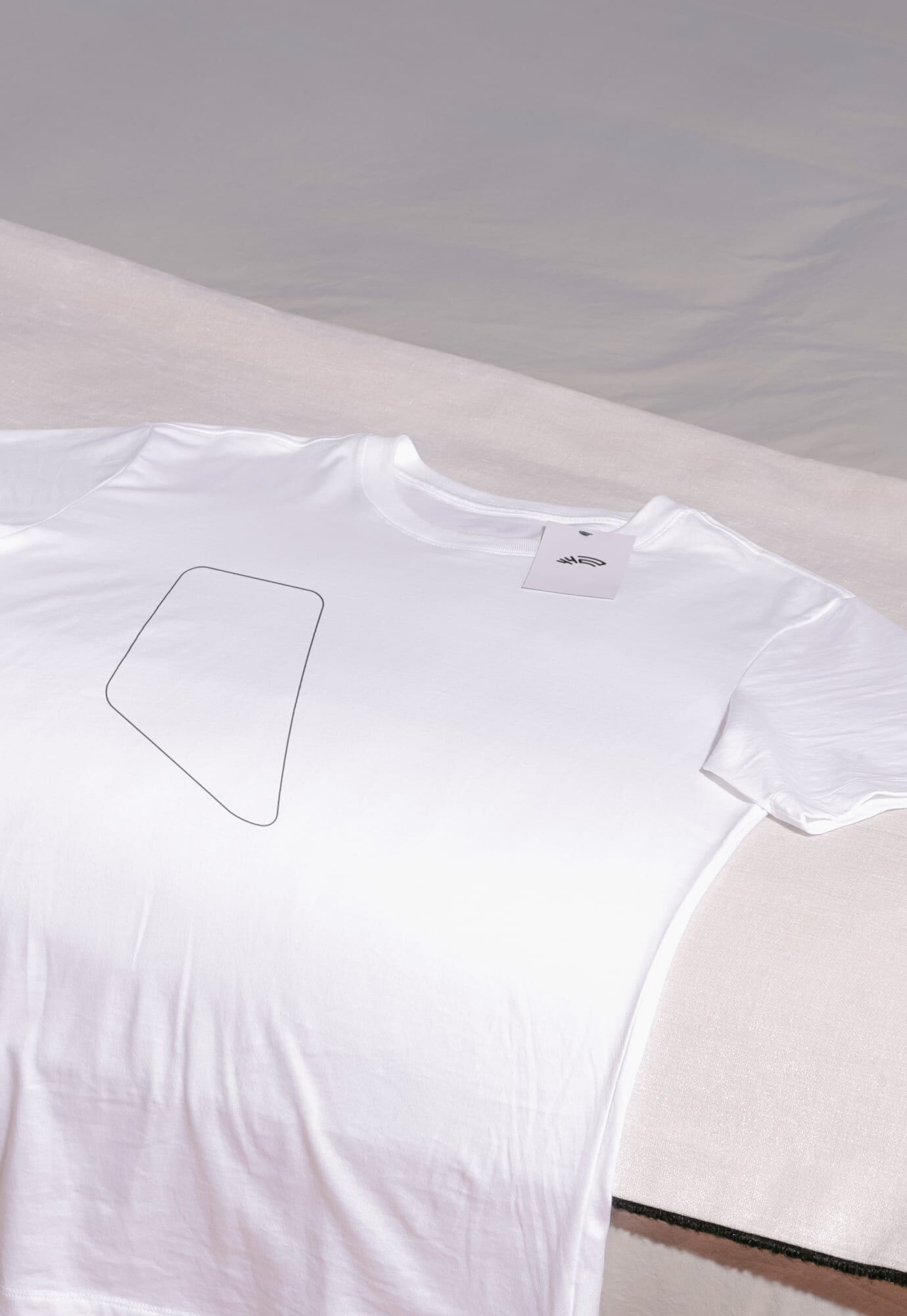
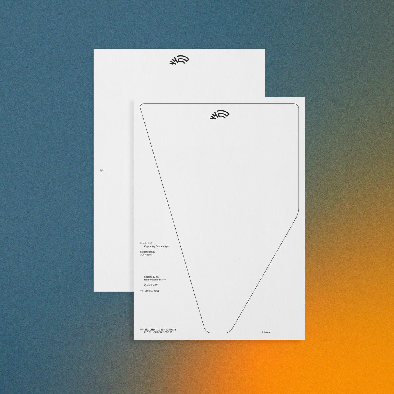
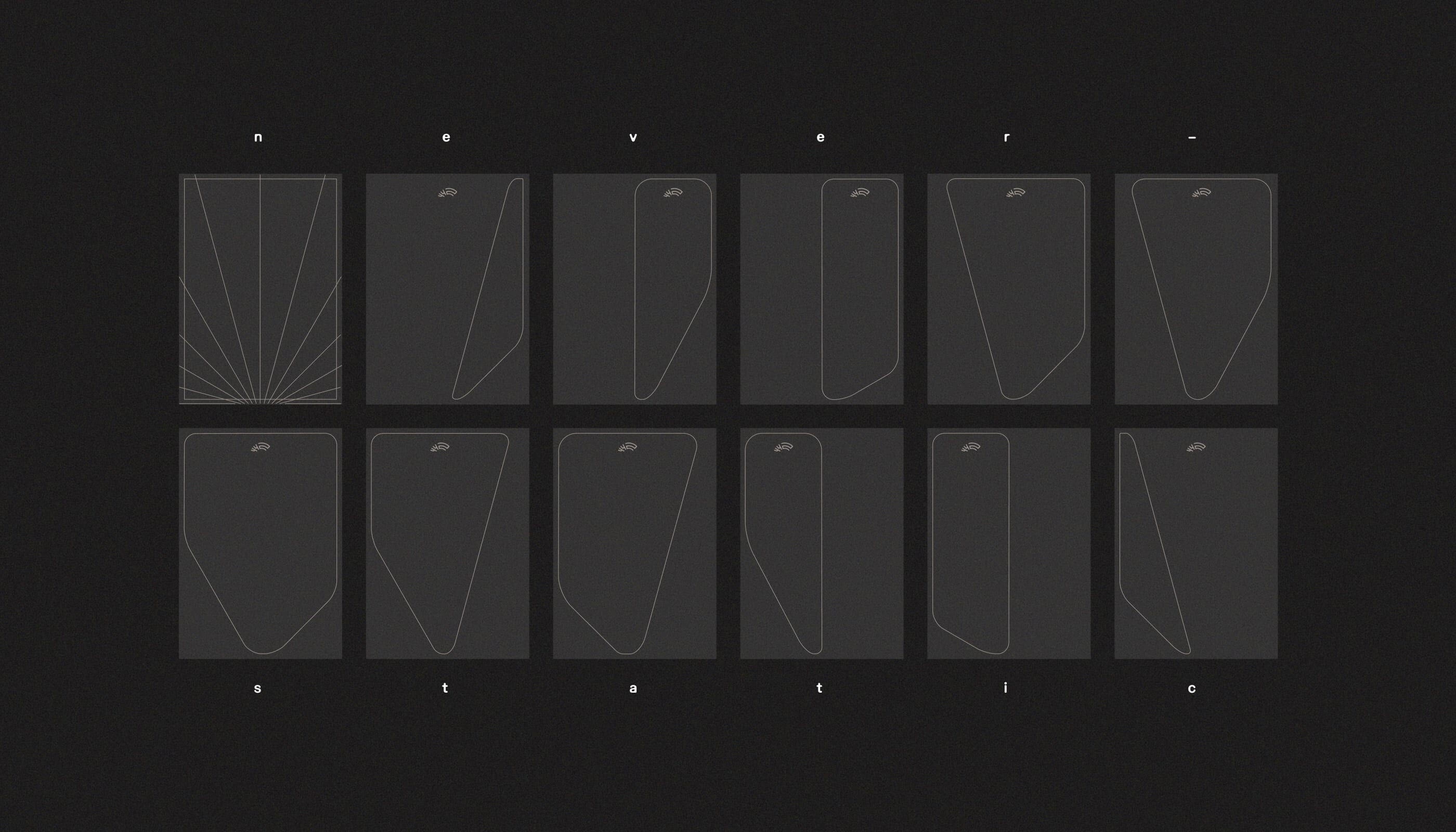
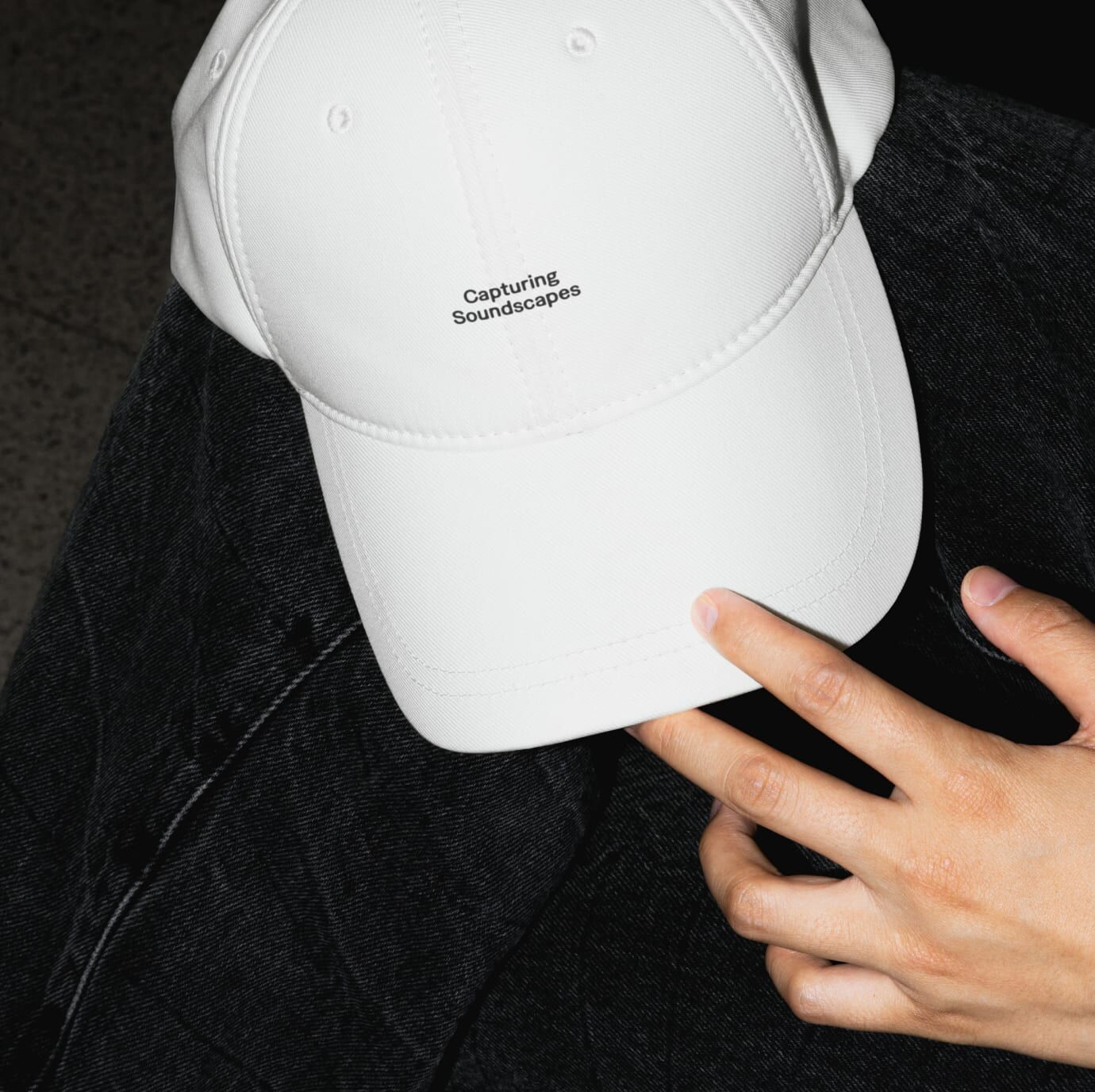
Studio 442 — capturing soundscapes
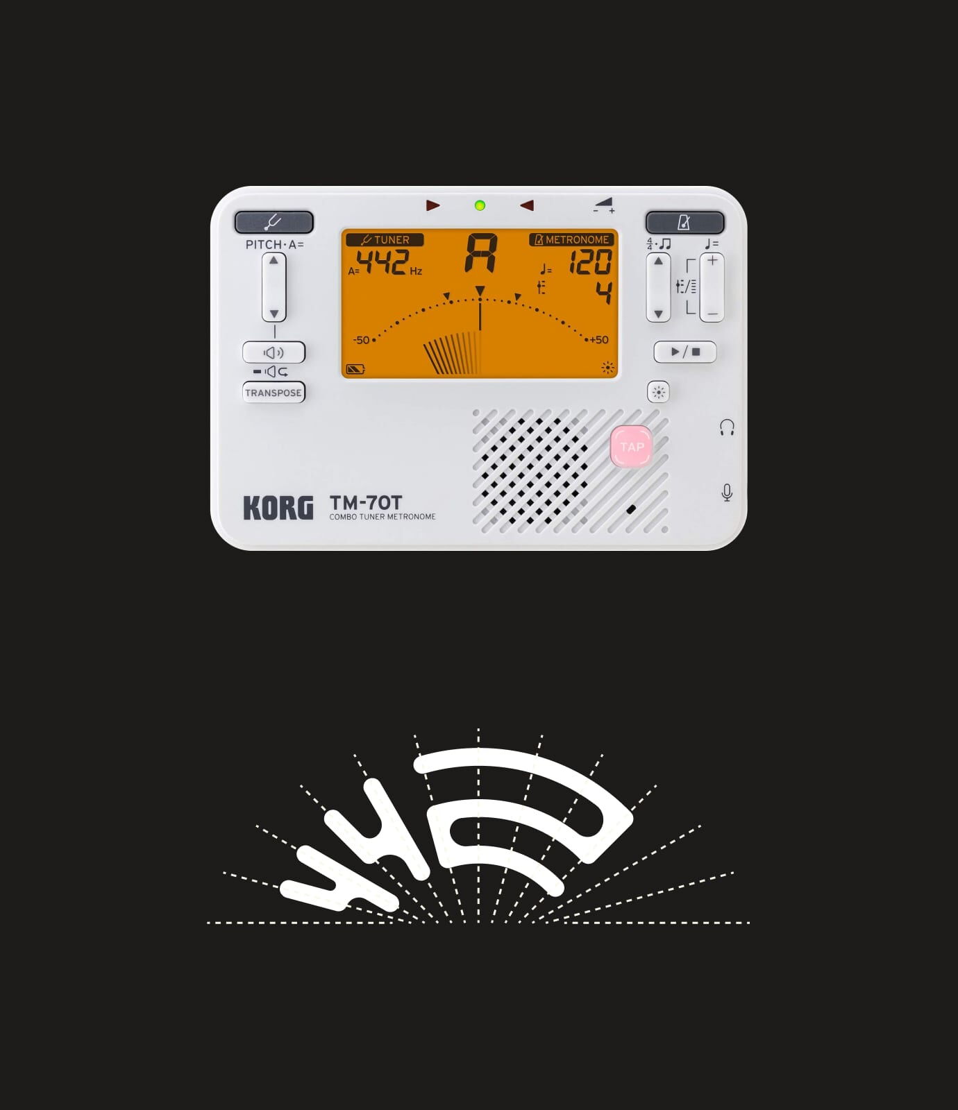
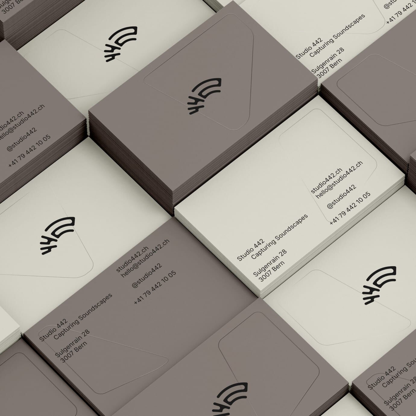
Studio 442 is a recording studio for orchestras and bands in Bern, Switzerland.
The frequency 442 is an important part of making music and inspired the name of the brand. The visual idea behind the brand is also based on that frequency, with the logo and the graphic element swinging from left to right like the needle of a chromatic tuner.

National Youth Windband of Switzerland


I had the great honor of working with the National Youth Wind Band of Switzerland and developing a complete rebranding, including brand strategy, for the orchestra.
This highly specialized youth orchestra consists of Switzerland’s elite young musicians and has a clear vision: to transcend boundaries. Musical boundaries, linguistic boundaries within the four language regions of Switzerland, and national boundaries through international conductors and competitions.
This transcending of boundaries is symbolized in the typography by stretching the letters and the different shapes within the logo. The guiding principle is „coming together to achieve extraordinary results“.


(Brand Strategy)
(Brand Design)
(Printed Applications)
(Brand Guidelines)
(Web
Design)
(Merch)
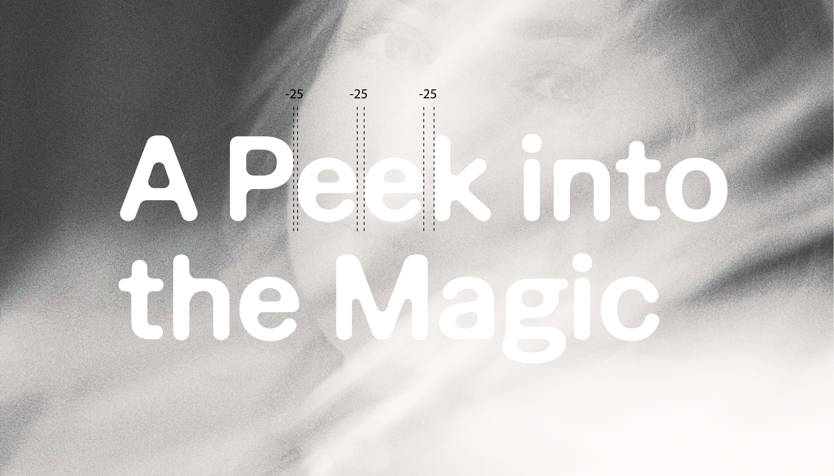
Potatis sans — the potato typeface


Potatis Sans is a contemporary sans serif designed around a single formal idea: controlled contrast within an otherwise solid structure.
The defining characteristic of the typeface lies in its stroke modulation. At the transition from curved strokes into vertical stems, the stroke tapers—introducing tension at points of structural change. This detail adds rhythm and differentiation without breaking the typeface’s overall neutrality.
The design balances clarity and character. While rooted in a robust, functional skeleton, the modulation creates a distinctive voice that emerges through use rather than assertion.
Potatis Sans comprises over 350 glyphs and supports all languages based on latin letters. The family is available in four weights.


(Type Design)
Chaos equals fun — the muta orchestra


The 2023 edition of muta orchestra is all about Harry Potter. For this reason, I’ve used four spells from the world of J.K. Rowling (Lumos, Expecto Patronum, Incendio and Accio) to design the concert posters for this year.


(Brand Design)
(Poster Design)
(Web Design)
(Merch)